
Logo & Identity | Soma Venice
Soma Venice is a new church plant in Venice, California. The church officially launched its Sunday gathering on March 1st, 2020. I worked on the logo and identity for about 4 months ahead of the launch and was able to have all the necessary signs and banners designed, printed, and delivered before the launch date.
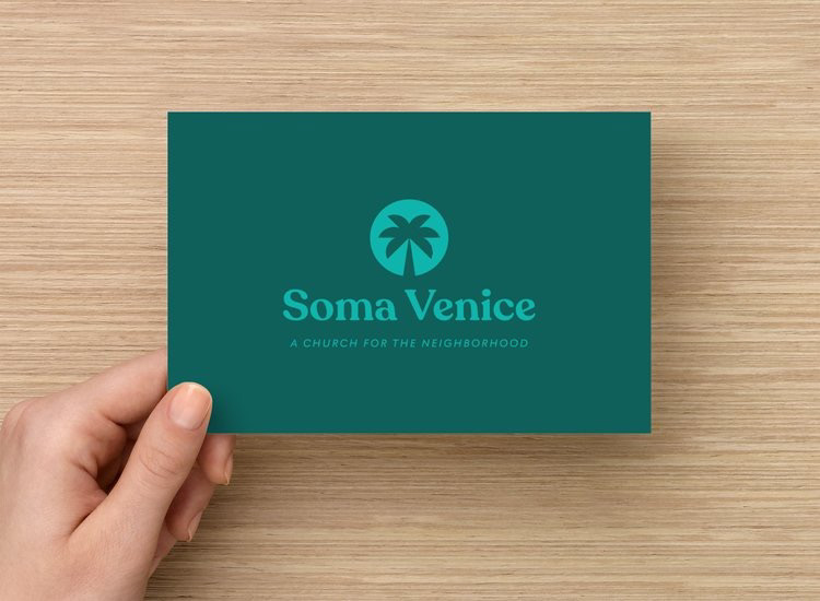
As with any identity, the foundation is a solid logo design which can be expanded into a larger identity framework. Here is the Soma Venice logo:
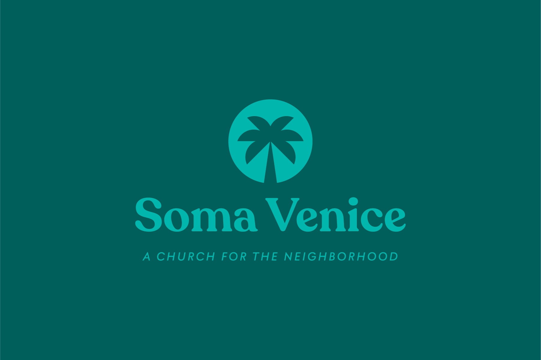
In order to expand the identity, I generated a monochrome color palette extending from the light green to the dark green in the above image. This color palette is foundational to the Soma Venice identity. The goal is to convey freshness, growth, and peace.
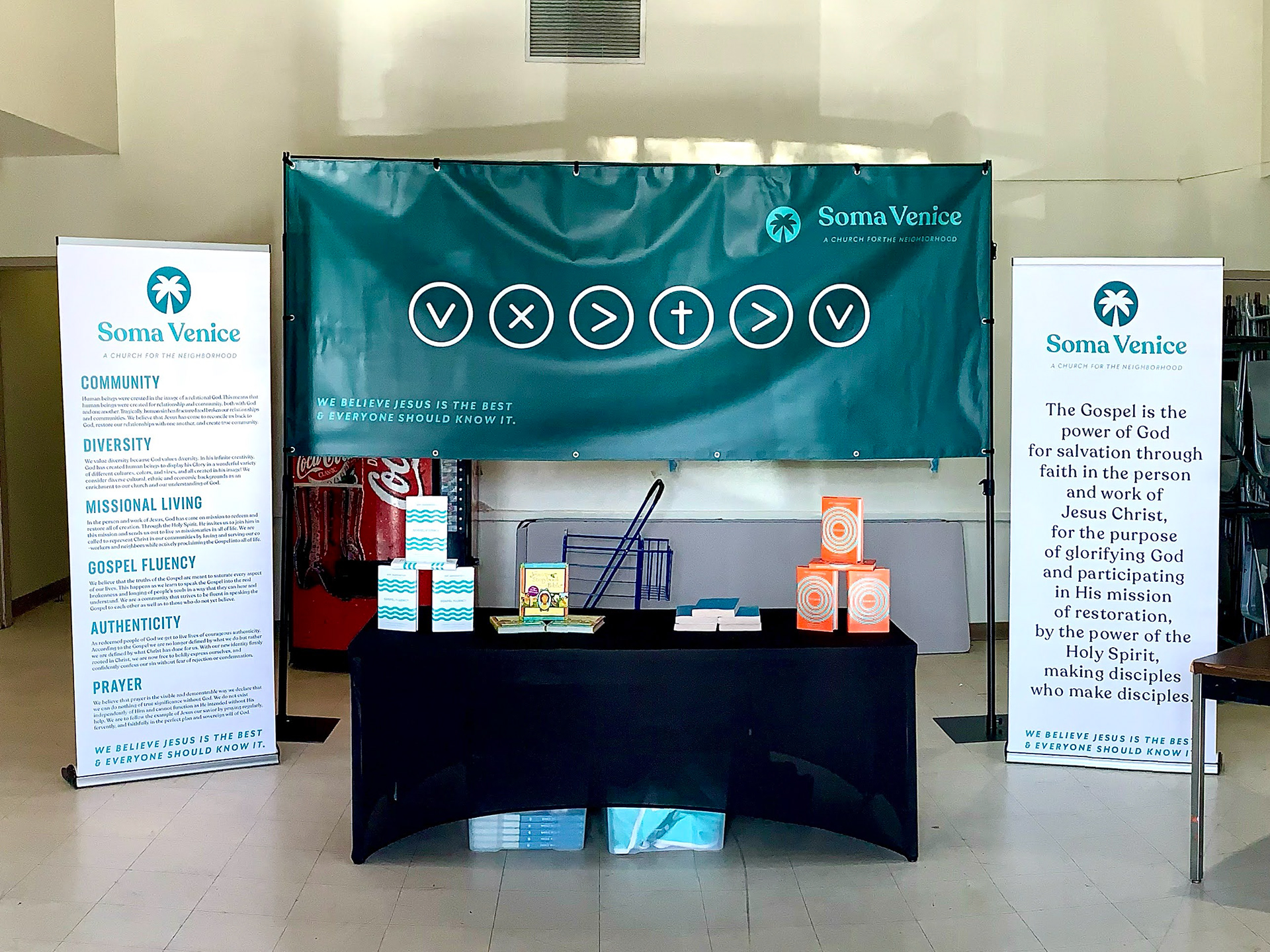
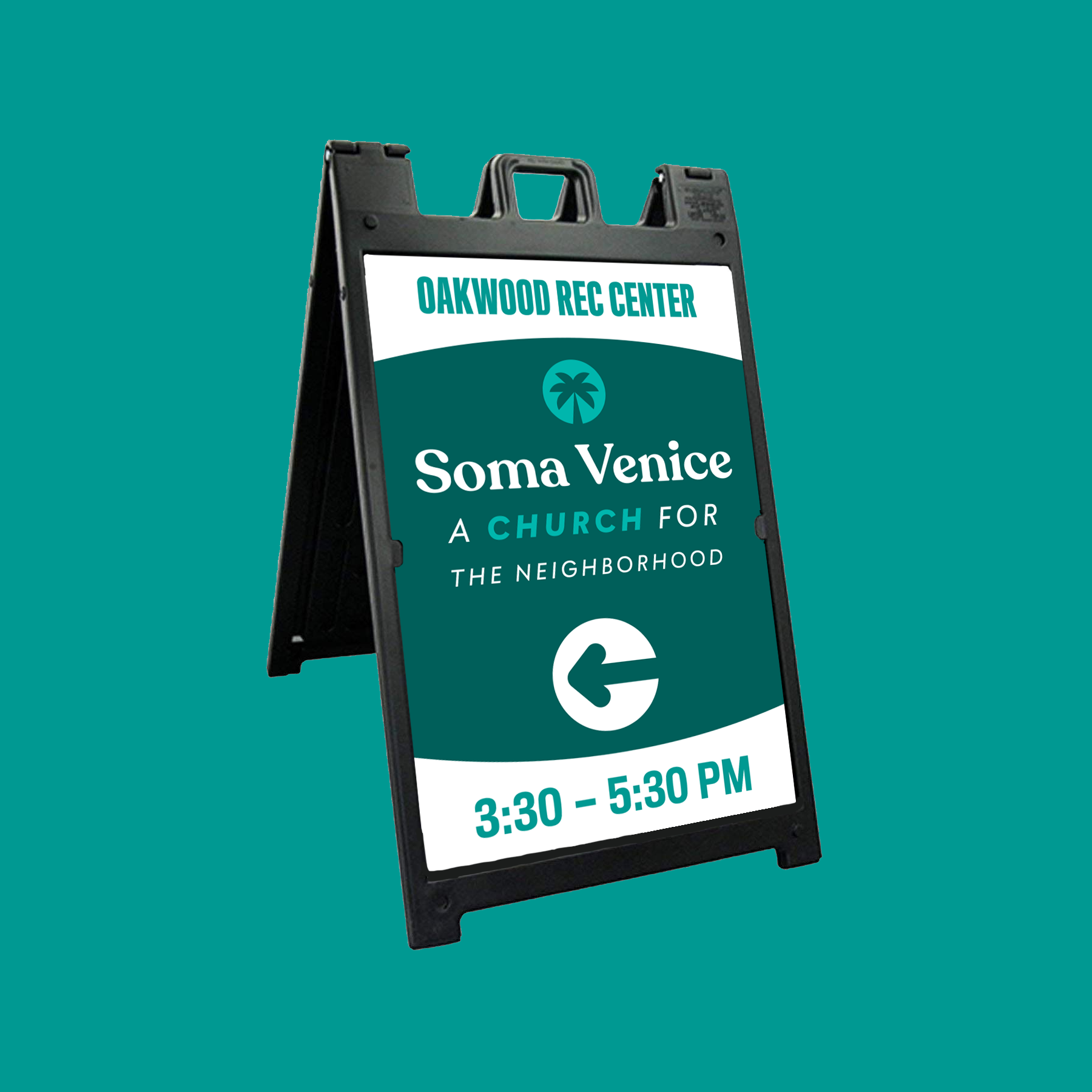
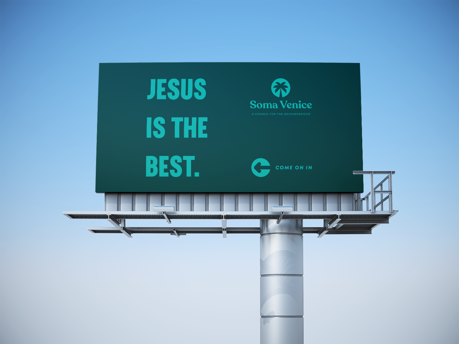
Below are some of the signs and banners I designed for Soma Venice; notice the expanded color palette across these items.

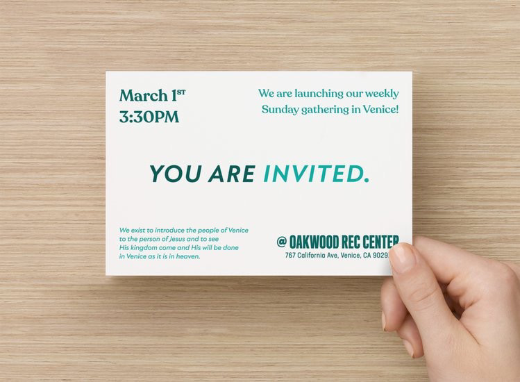
Ahead of the launch, Soma Venice wanted to canvas the neighborhoods around their gathering location. I made these postcards to drop off at homes and apartment buildings nearby. 500 postcards were distributed throughout the neighborhood as invitations, and 10 people actually showed up to the launch gathering on March 1st after seeing them!
I also worked with a friend, Jared Brient, on designing the website for Soma Venice. Jared worked on getting things set up on the site, and I finalized the content. I have added extra pages since then while maintaining the site; particularly around the pivots required because of the Covid-19 pandemic.