Along with the work itself, I would like to highlight my process for this project. Of course, I haven't invented anything in this process, it is all steps I have learned from mentors (mostly online) over the years.
Flipping Foremans is the name for my in-laws' real estate business. My mother-in-law, Dawn, is a high-producing realtor and my father-in-law, Terry, specializes in flipping houses. One thing I love about the brand is that it grew very organically for several years before they decided to formalize it and begin any targeted marketing as "Flipping Foremans". Their reputation for flipping houses into beautiful, desirable, well-priced masterpieces peaked in 2022 right alongside Dawn's best year of sales (completing 104 transactions in that calendar year).
They decided the best way to capitalize on their momentum was to bring the informal moniker "Flipping Foremans" to life as a fully realized brand identity and business. They asked me in January 2023 to help them develop a logo and brand identity package.
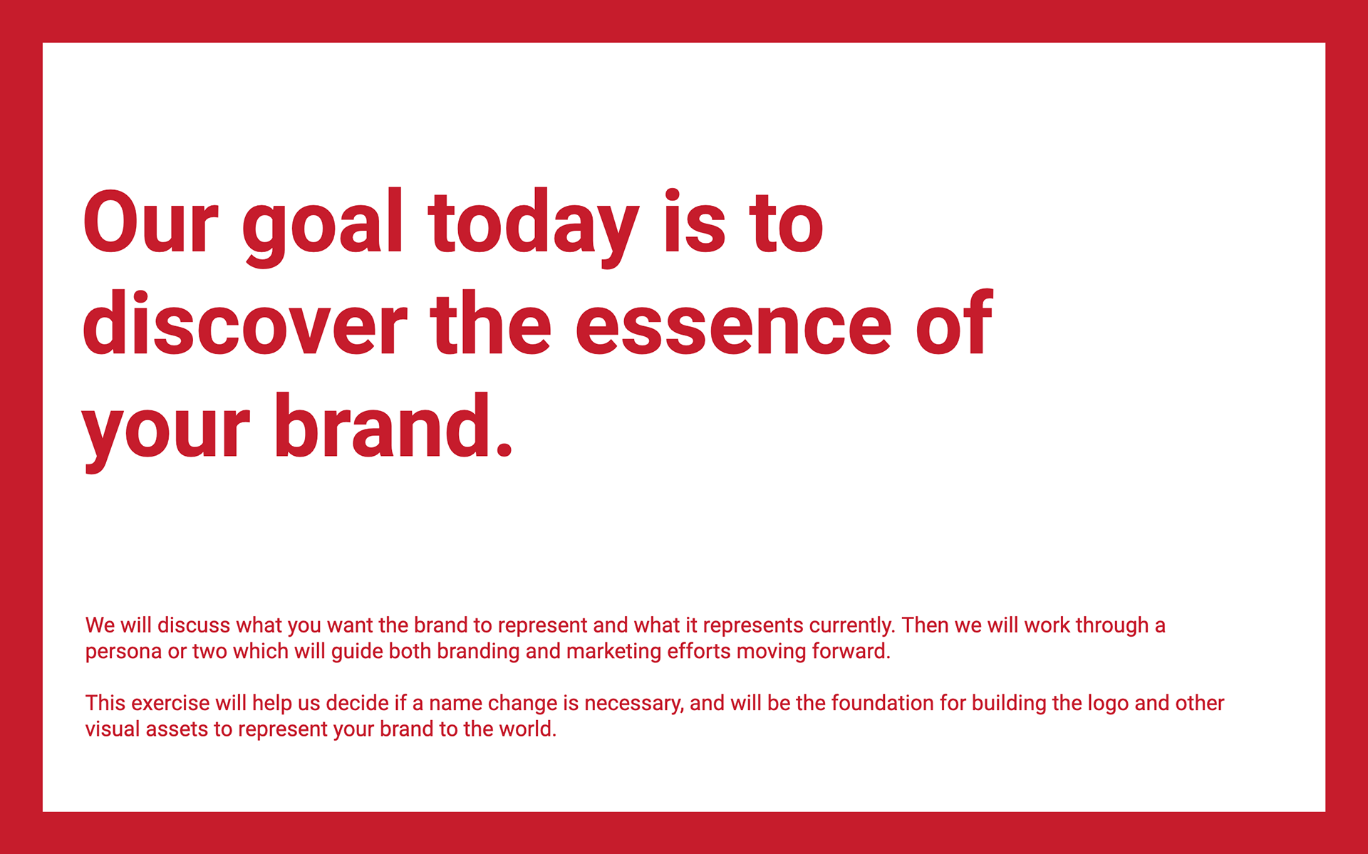
We began with a discovery session in which I led Dawn through a series of exercises to draw out her thoughts on both what people in their area already thought about them and what values she wanted the brand to represent. I should mention, Dawn was considering changing the name and part of the discovery session was to try to determine if a name change would make sense.
Here's the slides from the collaborative discovery session I ran with Dawn:
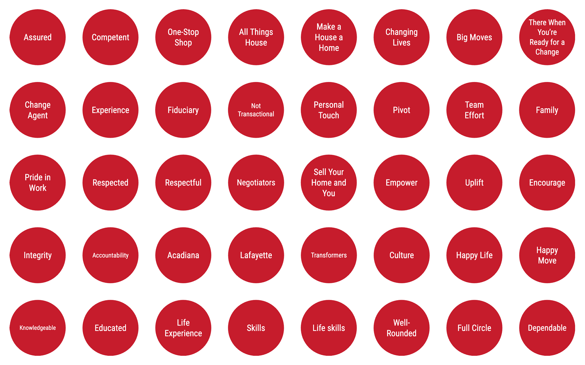

The 6 descriptors in the circles on the final slide are the culmination of the discovery session. We worked through all the descriptors from the second slide, narrowing down to the most specific set of values the Flipping Foremans brand should represent.
From there, I got straight to work designing a few options to pitch. I try to always pitch three options and ask my client to take at least one off the table right away.
I'm providing a video of the presentation (no audio) below, but I want to provide an explanation of my thoughts for each option in the pitch.
The first option is a very modern and somewhat abstract form of an "FF" monogram. My intention for this logo was that an abstract form would not carry its own connotations with it, and could instead be filled with the existing brand reputation, which was already very strong. This idea was inspired by the story of the Chase logo as told by Sagi Haviv in this interview.
The second option is a llama. Dawn loves llamas, and she is very public and funny about her love for these furry creatures. Everybody that knows her knows about her love for llamas, so I thought it could be a fun way to approach a brand which would primarily be driven by her personality. It would also be memorable and unique in the real estate industry, a big plus for a visually saturated industry.
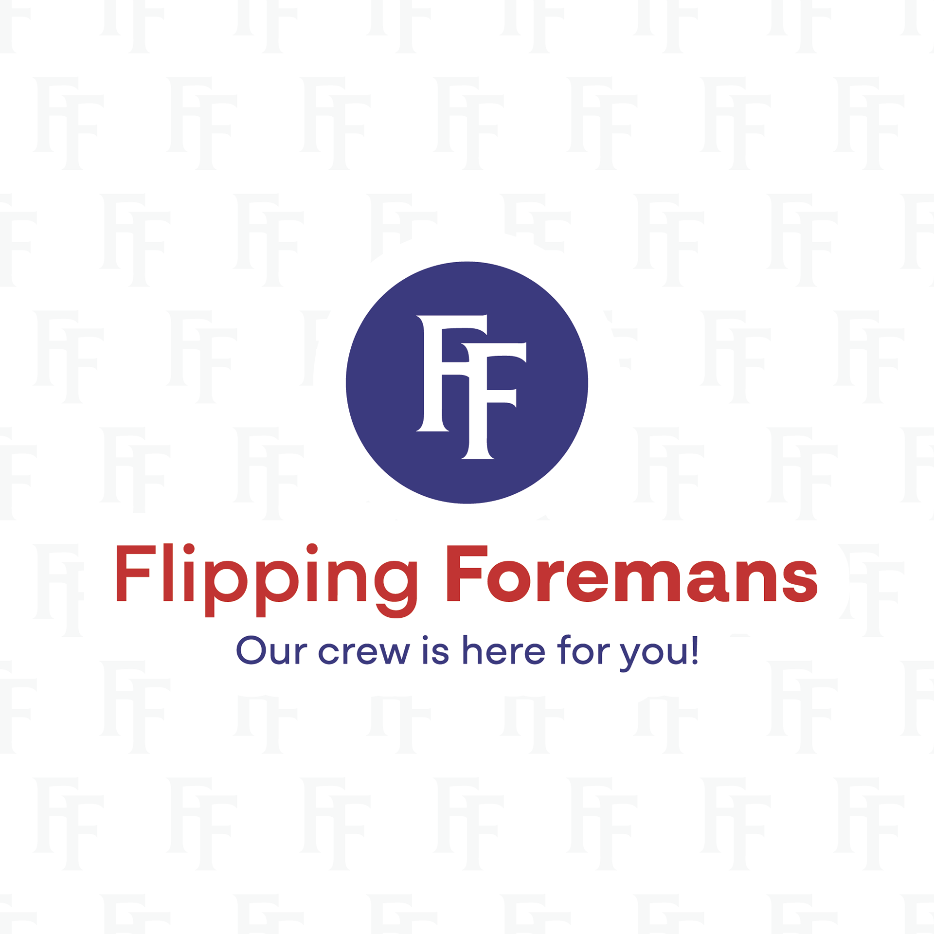
The third option is inspired by the logo from the women's fitness studio Dawn ran for almost 20 years. That logo was a monogram using the Friz Quadrata font, so I used the same font and maintained a familiar silhouette (side-by-side can be found below). By connecting Flipping Foremans to Dawn's history, a well-known history to her audience, the hope was to connect the reputation of the fitness studio to the growing reputation of the Flipping Foremans.
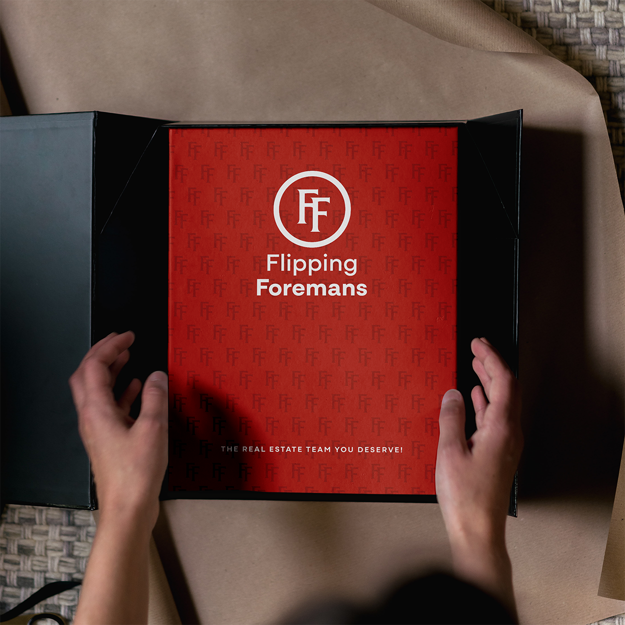
Dawn eliminated the llama option immediately after the presentation, then deliberated for a couple of days before ultimately choosing the third option. We then went through some small revisions and produced the final brand identity!
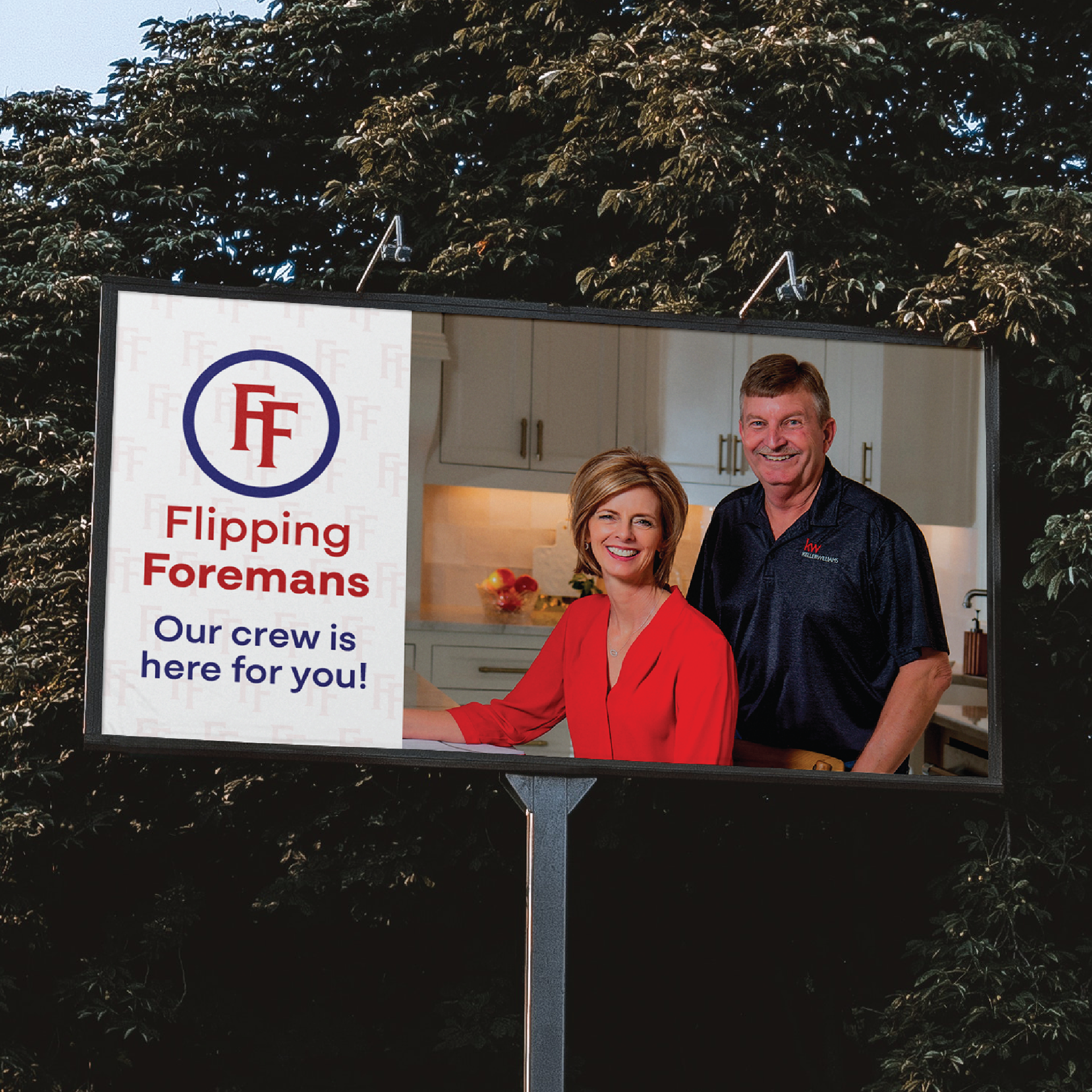
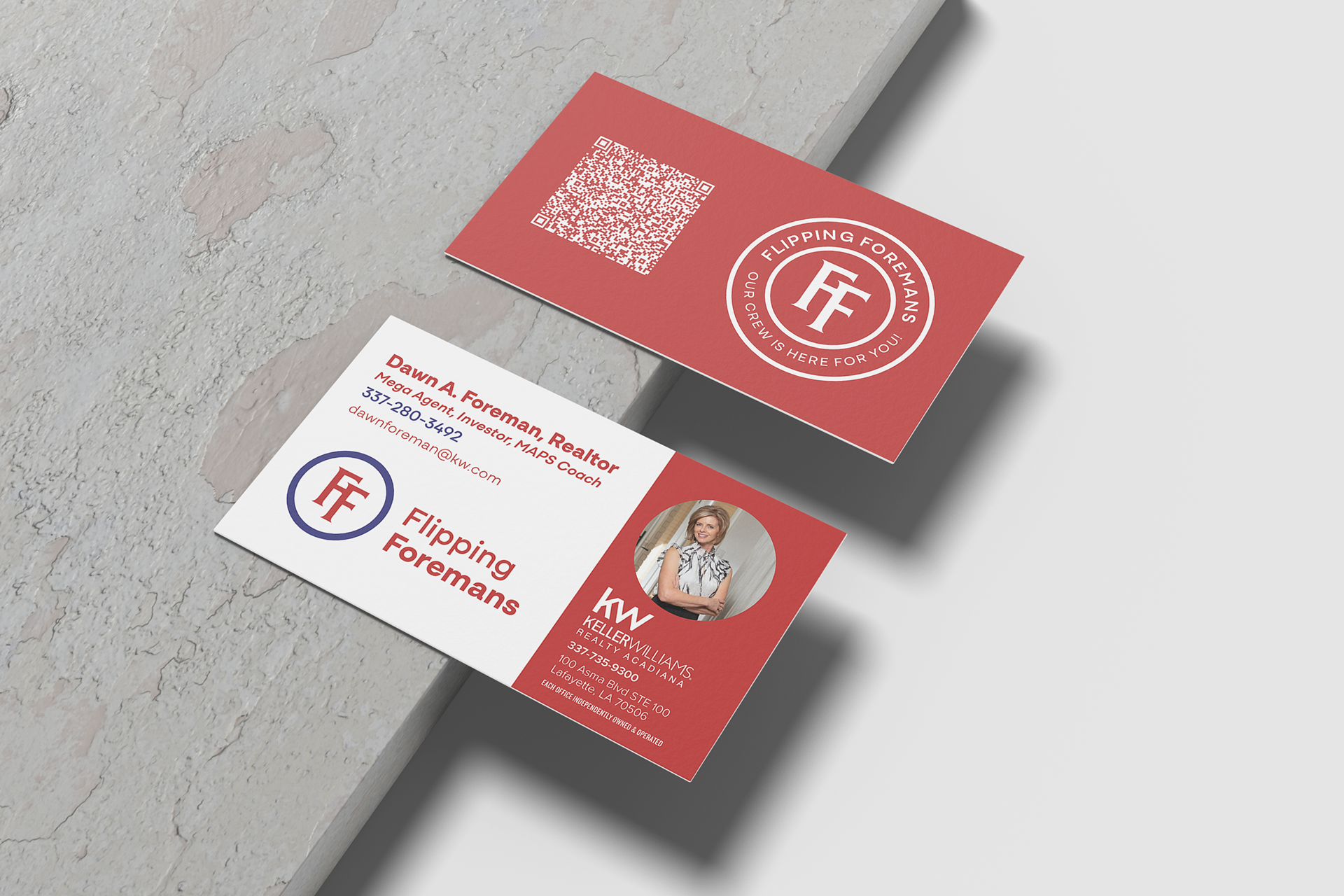
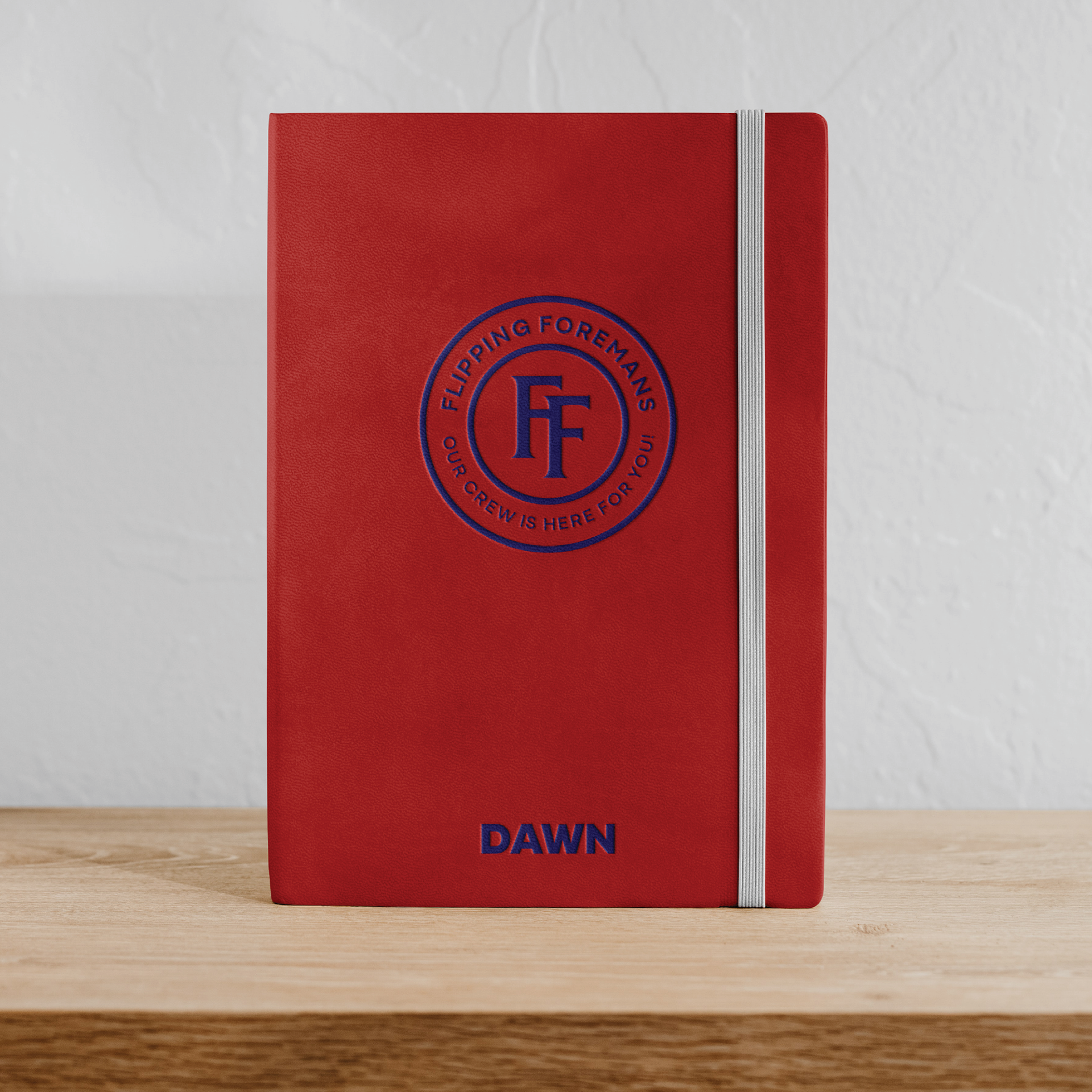
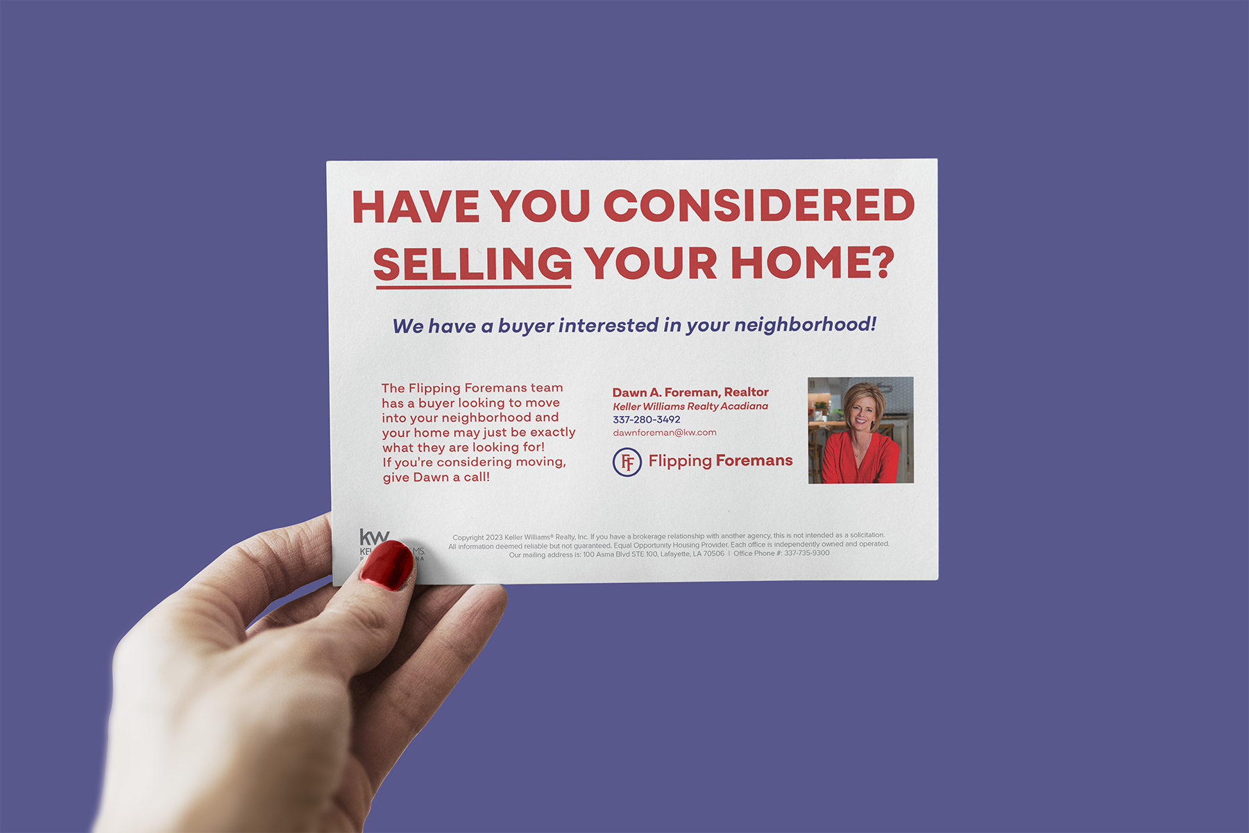
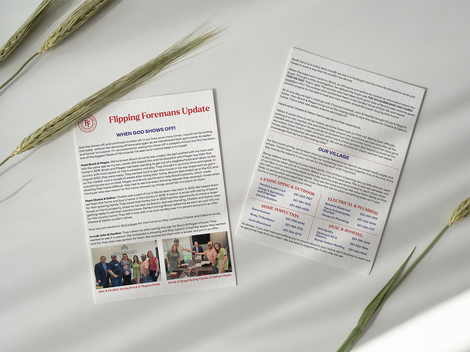
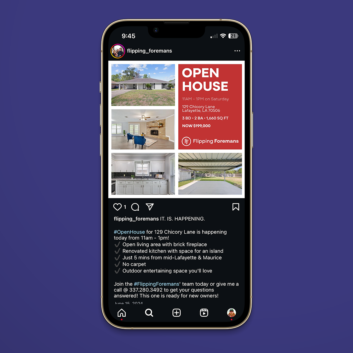
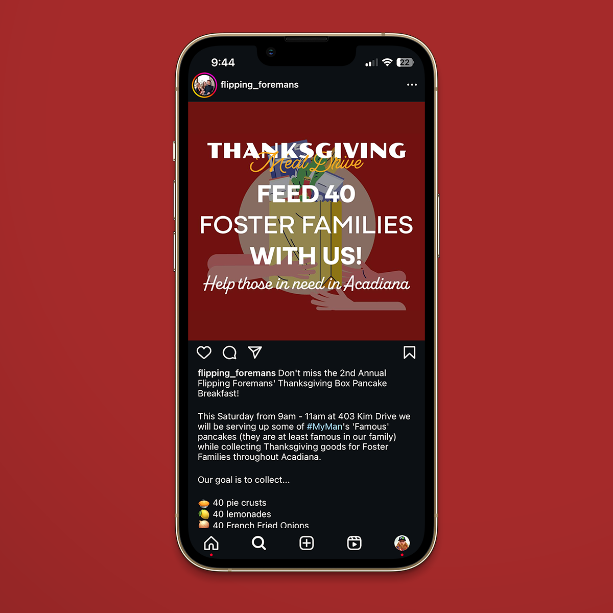
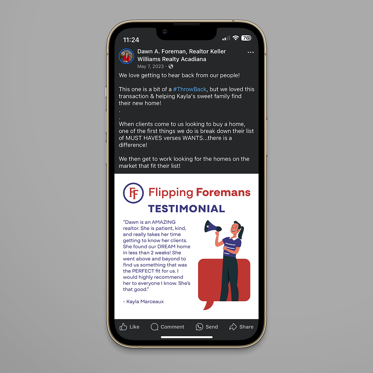
We have continued working with Flipping Foremans, designing some social media assets, mailers, and postcards. Here are some examples of our ongoing work:
