Logo Design | Los Angeles Soccer Club
I worked with Rad, an agency here in Los Angeles, to develop a new logo for Los Angeles Soccer Club (LASC). The club was founded in 1951 by six sports enthusiasts of German descent to support all sporting activities in the city, but especially to grow the game of soccer (football) in the US. In 2020, LASC launched the inaugural season for their youth program. 50+ boys and girls teams of all ages, across Los Angeles and the San Gabriel Valley, with hubs in Downtown LA, Duarte, Covina, and Pomona.
As part of this new direction for the club, the Board of Directors decided to initiate a logo redesign in order to bring the visual identity of the club more in line with the modern era and the new generation of club players and supporters.
Find the project brief below:
My first presentation to the club included three distinct directions. My primary goal was to provide a more modern take on the German heritage intrinsic to the club.
Feedback from this initial round of designs was positive, and the customer wanted to try to combine the first two designs and add either a more Los Angeles-specific element or a nod to the club's Aztec/Latino roots.
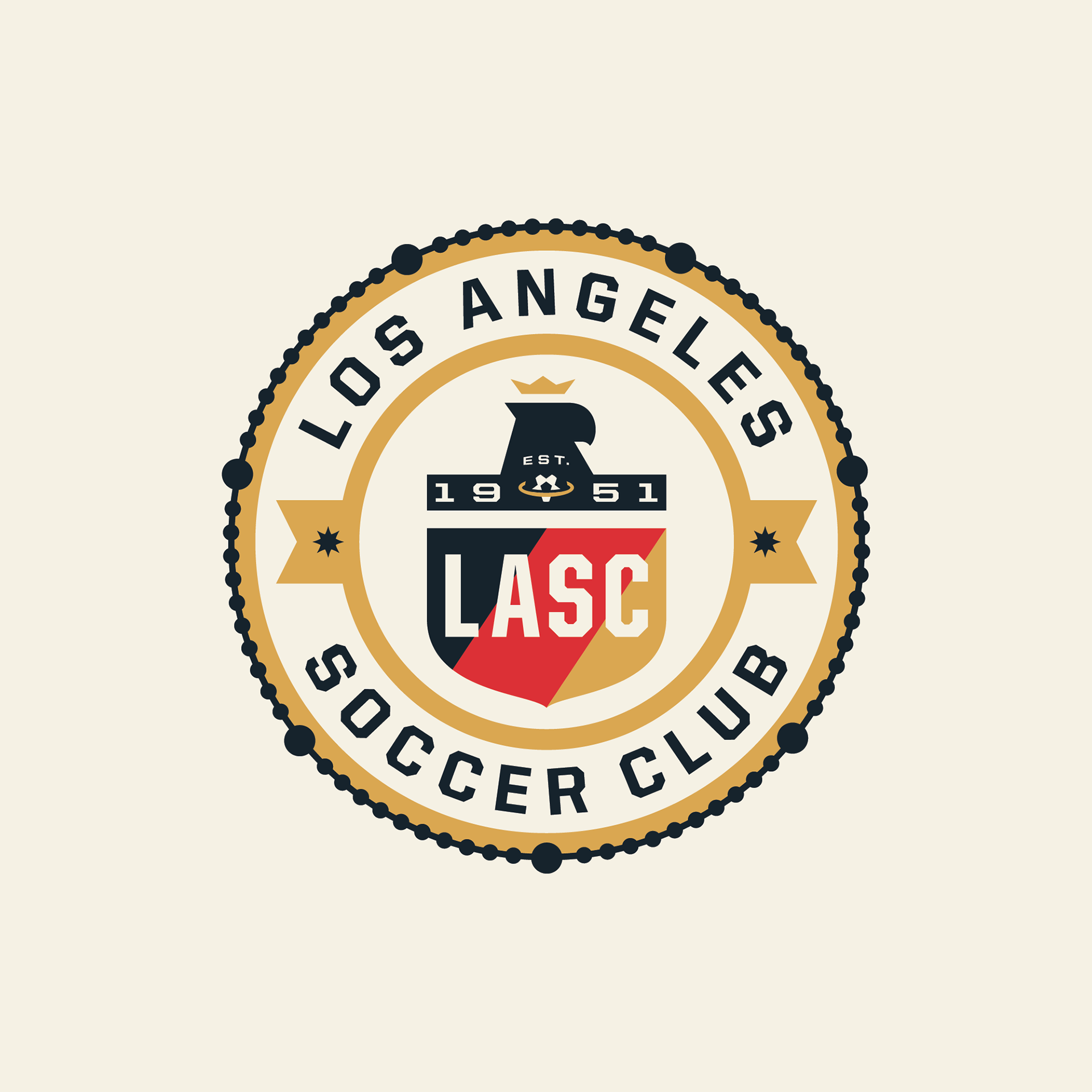
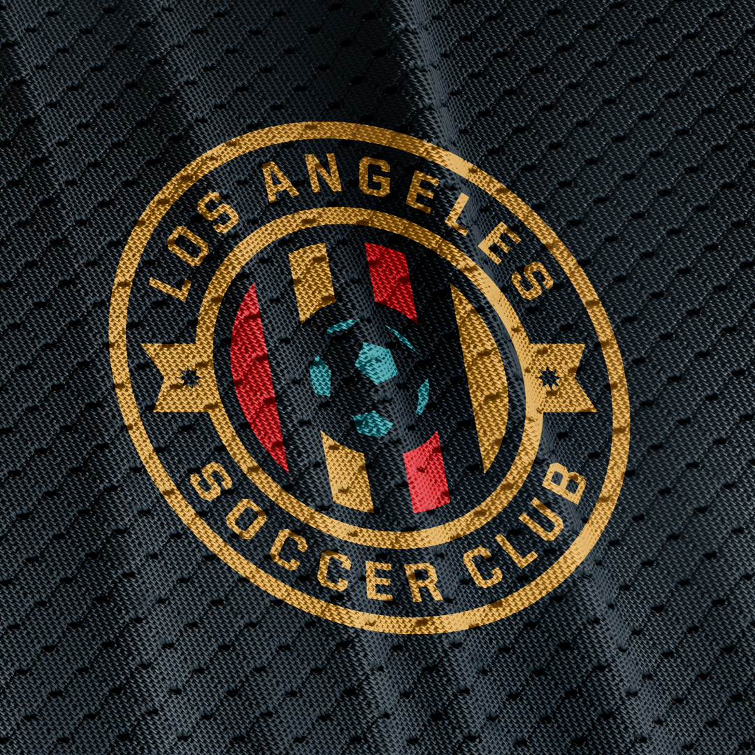
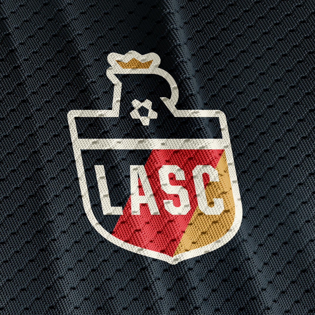
In the presentation below, there are three options with a full color view first, then a slide showing the logo in one color, then a slide with a pair of mockups (changed up the second mockup because the soccer ball didn't seem like the most realistic option), then finally a slide displaying how the logo could be integrated into the circle badge from the initial presentation. I added a new element on the outside of all the circle badges; it's essentially the same 77-bead rosary as can be found on the Seal of Los Angeles, as a nod to the Spanish Missions in the early years of LA. I made a few little tweaks to the rosary from the city seal. I also added the full phrase "Los Angeles Soccer Club" to the shield, as requested.
The first logo option maintains the soccer ball, but now includes a halo around the ball as a nod to LA being "The City of Angels." The final slide for this option there are 3 circle badges; I wanted to highlight an extra possibility the haloed ball provides as a symbol to itself, without the need to include the eagle or shield. This flexibility provides extra opportunities to express the brand across necessary media (socials, website, apparel, print materials, etc.).
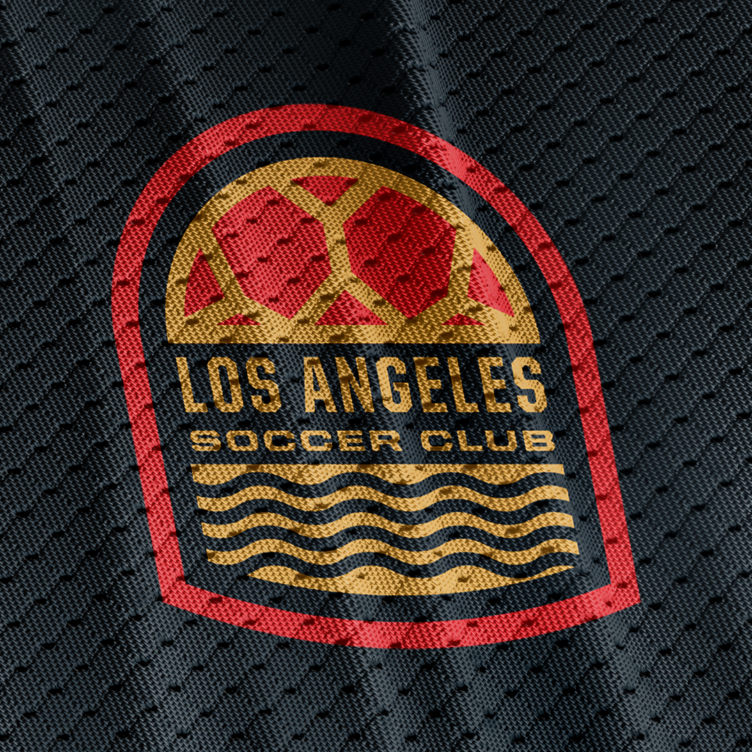
The second logo option replaces the soccer ball with a wave. Being a coastal city is a rich part of LA's heritage and the wave provides a widely recognizable symbol of the city.
The third logo replaces the soccer ball with a palm tree, another symbol of the tropical nature of LA.
I looked for some Aztec or Latino symbols of unity, as the client had mentioned, but could not find anything other than the Hunab Ku symbol, which did not seem to be a good fit. The symbol itself is too complex to use in many of the necessary smaller applications of the logo, specifically as the crest on jerseys and similar apparel. The Hunab Ku is also traditionally a reference specifically to the Christian God, which I felt would be too restrictive for a club of this size in Los Angeles; it could be easily misconstrued as an attempt to highlight Christianity in the club's brand.
Following that second presentation, the client wanted to refine the option with the haloed soccer ball, while adding the year the club was founded: 1951. See the presentation below which includes three options I pitched.
In the end, the club selected the badge below which includes the year of the founding of the club, the haloed soccer ball, and the full badge with rosary beads on the border. This project was a lot of fun to work on, and though the club has since chosen to move in a different direction with their branding, I am proud of the work I was able to produce alongside the guys at Rad.